View Patricia Diane Briggs-Kellyminimalist text-based tattoo, Monospace font ultra-realistic, perfectly placed, high-quality font design, photo-realistic shading, 8k, high quality, finely detailed typograph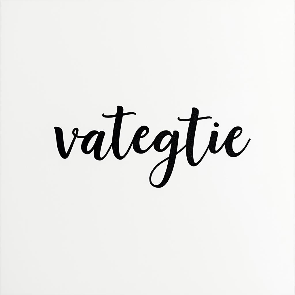
Patricia Diane Briggs-Kellyminimalist text-based tattoo, Monospace font ultra-realistic, perfectly placed, high-quality font design, photo-realistic shading, 8k, high quality, finely detailed typograph
Patricia Diane Briggs-Kellyminimalist text-based tattoo, Monospace font ultra-realistic, perfectly placed, high-quality font design, photo-realistic shading, 8k, high quality, finely detailed typograph
Monospace Text
View Divine 3:16minimalist text-based tattoo, Monospace font ultra-realistic, perfectly placed, high-quality font design, photo-realistic shading, 8k, high quality, finely detailed typograph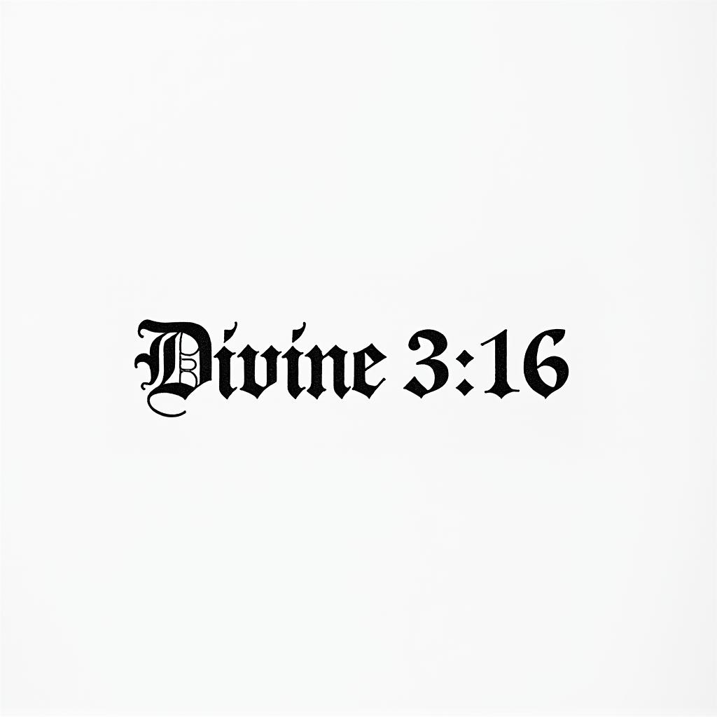
Divine 3:16minimalist text-based tattoo, Monospace font ultra-realistic, perfectly placed, high-quality font design, photo-realistic shading, 8k, high quality, finely detailed typograph
Divine 3:16minimalist text-based tattoo, Monospace font ultra-realistic, perfectly placed, high-quality font design, photo-realistic shading, 8k, high quality, finely detailed typograph
Monospace Text
View Amanda, Cancer, Chicagominimalist text-based tattoo, Monospace font ultra-realistic, perfectly placed, high-quality font design, photo-realistic shading, 8k, high quality, finely detailed typograph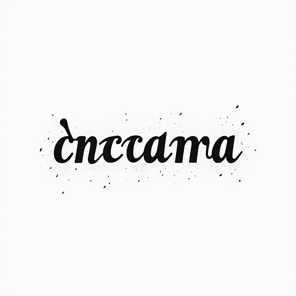
Amanda, Cancer, Chicagominimalist text-based tattoo, Monospace font ultra-realistic, perfectly placed, high-quality font design, photo-realistic shading, 8k, high quality, finely detailed typograph
Amanda, Cancer, Chicagominimalist text-based tattoo, Monospace font ultra-realistic, perfectly placed, high-quality font design, photo-realistic shading, 8k, high quality, finely detailed typograph
Monospace Text
View Words “my favorite personminimalist text-based tattoo, Monospace font ultra-realistic, perfectly placed, high-quality font design, photo-realistic shading, 8k, high quality, finely detailed typograph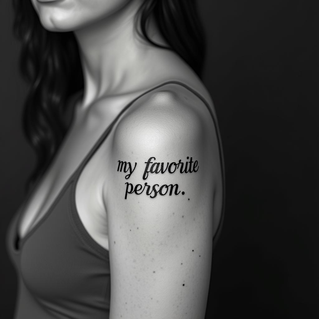
Words “my favorite personminimalist text-based tattoo, Monospace font ultra-realistic, perfectly placed, high-quality font design, photo-realistic shading, 8k, high quality, finely detailed typograph
Words “my favorite personminimalist text-based tattoo, Monospace font ultra-realistic, perfectly placed, high-quality font design, photo-realistic shading, 8k, high quality, finely detailed typograph
Monospace Text
View Butterfly with intricate wing patternsminimalist text-based tattoo, Monospace font ultra-realistic, perfectly placed, high-quality font design, photo-realistic shading, 8k, high quality, finely detailed typograph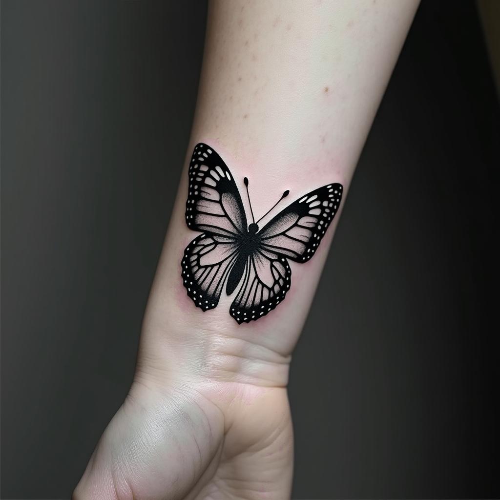
Butterfly with intricate wing patternsminimalist text-based tattoo, Monospace font ultra-realistic, perfectly placed, high-quality font design, photo-realistic shading, 8k, high quality, finely detailed typograph
Butterfly with intricate wing patternsminimalist text-based tattoo, Monospace font ultra-realistic, perfectly placed, high-quality font design, photo-realistic shading, 8k, high quality, finely detailed typograph
Monospace Text
View Amberminimalist text-based tattoo, Monospace font ultra-realistic, perfectly placed, high-quality font design, photo-realistic shading, 8k, high quality, finely detailed typograph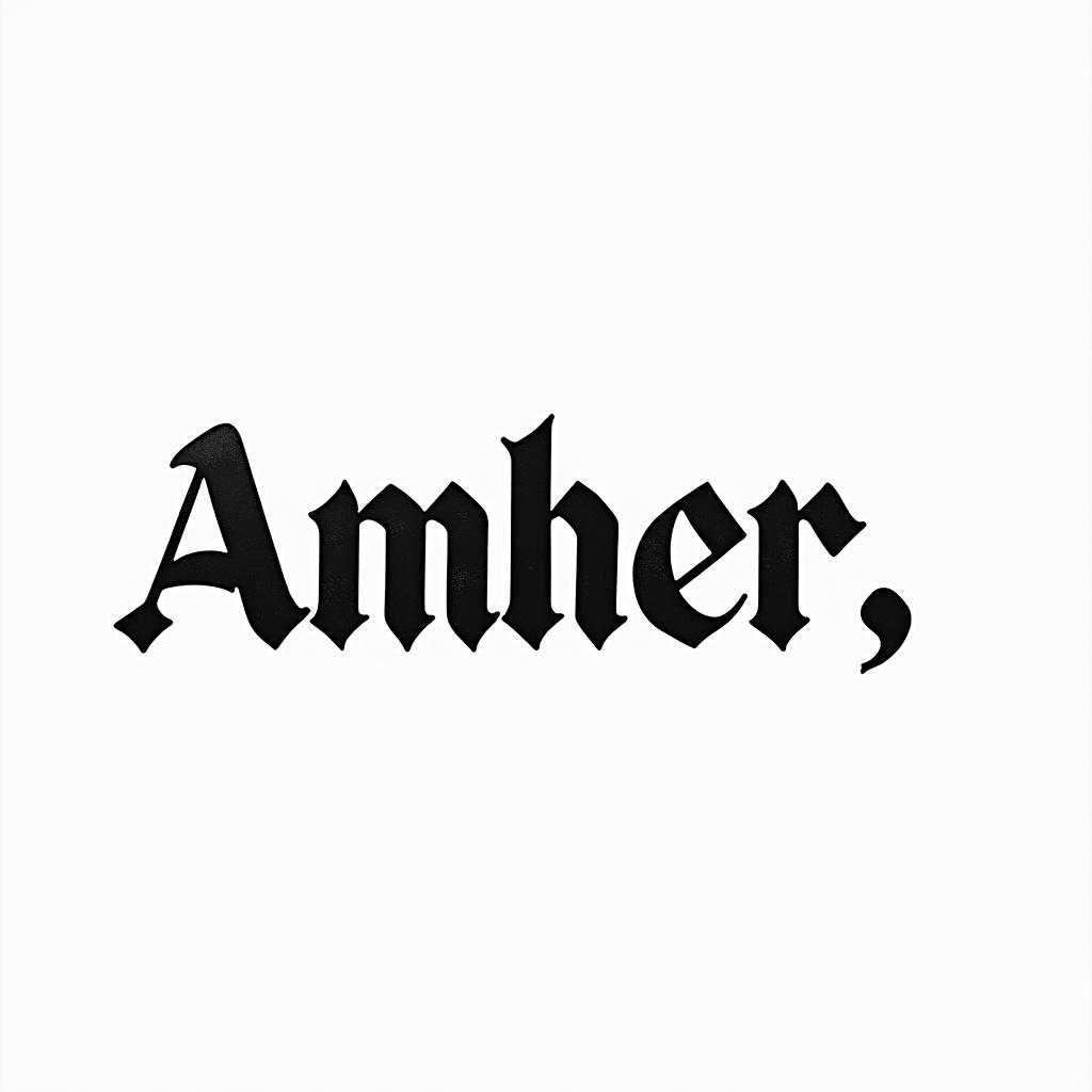
Amberminimalist text-based tattoo, Monospace font ultra-realistic, perfectly placed, high-quality font design, photo-realistic shading, 8k, high quality, finely detailed typograph
Amberminimalist text-based tattoo, Monospace font ultra-realistic, perfectly placed, high-quality font design, photo-realistic shading, 8k, high quality, finely detailed typograph
Monospace Text
View Elaineminimalist text-based tattoo, Monospace font ultra-realistic, perfectly placed, high-quality font design, photo-realistic shading, 8k, high quality, finely detailed typograph
Elaineminimalist text-based tattoo, Monospace font ultra-realistic, perfectly placed, high-quality font design, photo-realistic shading, 8k, high quality, finely detailed typograph
Elaineminimalist text-based tattoo, Monospace font ultra-realistic, perfectly placed, high-quality font design, photo-realistic shading, 8k, high quality, finely detailed typograph
Monospace Text
View Don,t Think,Feelminimalist text-based tattoo, Monospace font ultra-realistic, perfectly placed, high-quality font design, photo-realistic shading, 8k, high quality, finely detailed typograph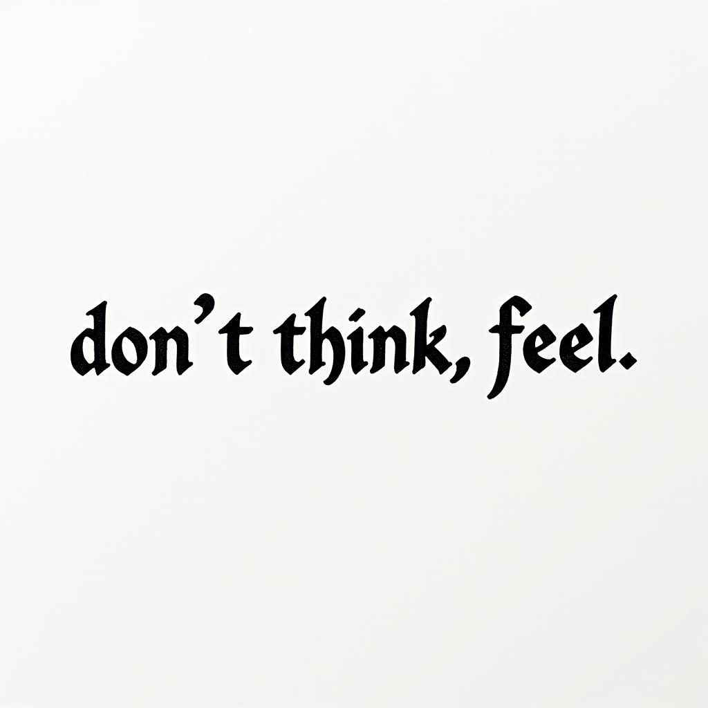
Don,t Think,Feelminimalist text-based tattoo, Monospace font ultra-realistic, perfectly placed, high-quality font design, photo-realistic shading, 8k, high quality, finely detailed typograph
Don,t Think,Feelminimalist text-based tattoo, Monospace font ultra-realistic, perfectly placed, high-quality font design, photo-realistic shading, 8k, high quality, finely detailed typograph
Monospace Text
View Axel 20052019minimalist text-based tattoo, Monospace font ultra-realistic, perfectly placed, high-quality font design, photo-realistic shading, 8k, high quality, finely detailed typograph
Axel 20052019minimalist text-based tattoo, Monospace font ultra-realistic, perfectly placed, high-quality font design, photo-realistic shading, 8k, high quality, finely detailed typograph
Axel 20052019minimalist text-based tattoo, Monospace font ultra-realistic, perfectly placed, high-quality font design, photo-realistic shading, 8k, high quality, finely detailed typograph
Monospace Text
View Kelly L.IV.MCMLXXXIVminimalist text-based tattoo, Monospace font ultra-realistic, perfectly placed, high-quality font design, photo-realistic shading, 8k, high quality, finely detailed typograph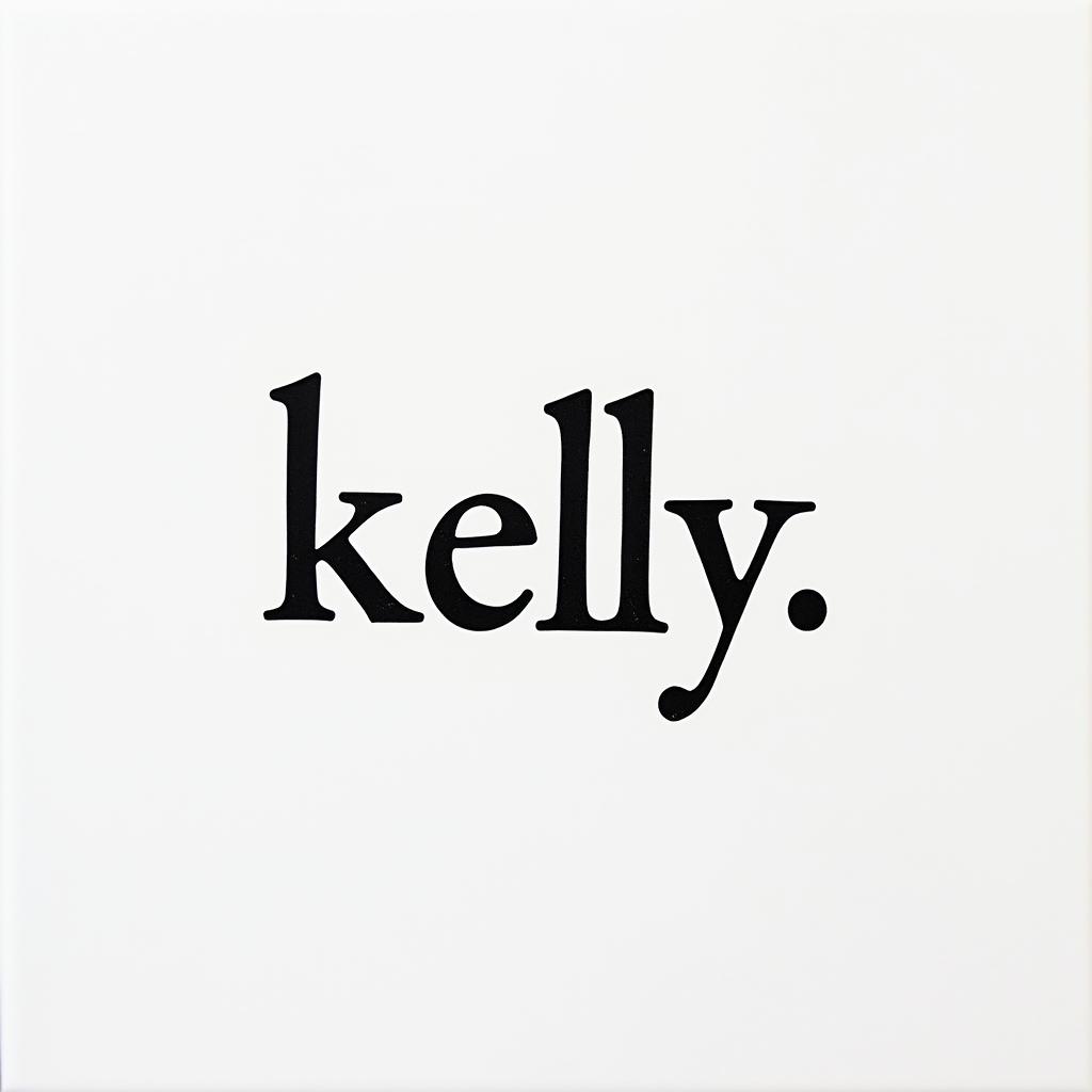
Kelly L.IV.MCMLXXXIVminimalist text-based tattoo, Monospace font ultra-realistic, perfectly placed, high-quality font design, photo-realistic shading, 8k, high quality, finely detailed typograph
Kelly L.IV.MCMLXXXIVminimalist text-based tattoo, Monospace font ultra-realistic, perfectly placed, high-quality font design, photo-realistic shading, 8k, high quality, finely detailed typograph
Monospace Text
View The horrors persist but so do weminimalist text-based tattoo, Monospace font ultra-realistic, perfectly placed, high-quality font design, photo-realistic shading, 8k, high quality, finely detailed typograph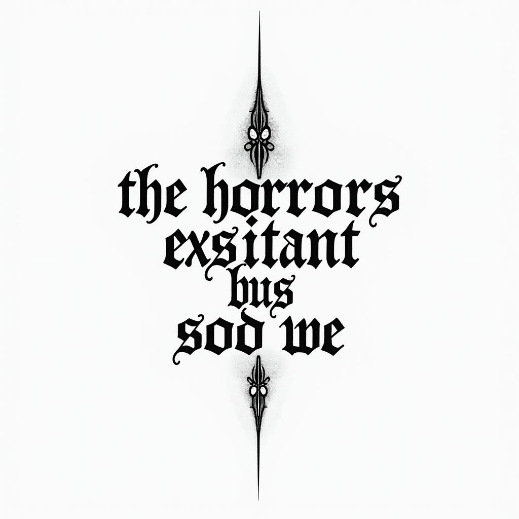
The horrors persist but so do weminimalist text-based tattoo, Monospace font ultra-realistic, perfectly placed, high-quality font design, photo-realistic shading, 8k, high quality, finely detailed typograph
The horrors persist but so do weminimalist text-based tattoo, Monospace font ultra-realistic, perfectly placed, high-quality font design, photo-realistic shading, 8k, high quality, finely detailed typograph
Monospace Text
View Infinity symbol. Made with the name Robertminimalist text-based tattoo, Monospace font ultra-realistic, perfectly placed, high-quality font design, photo-realistic shading, 8k, high quality, finely detailed typograph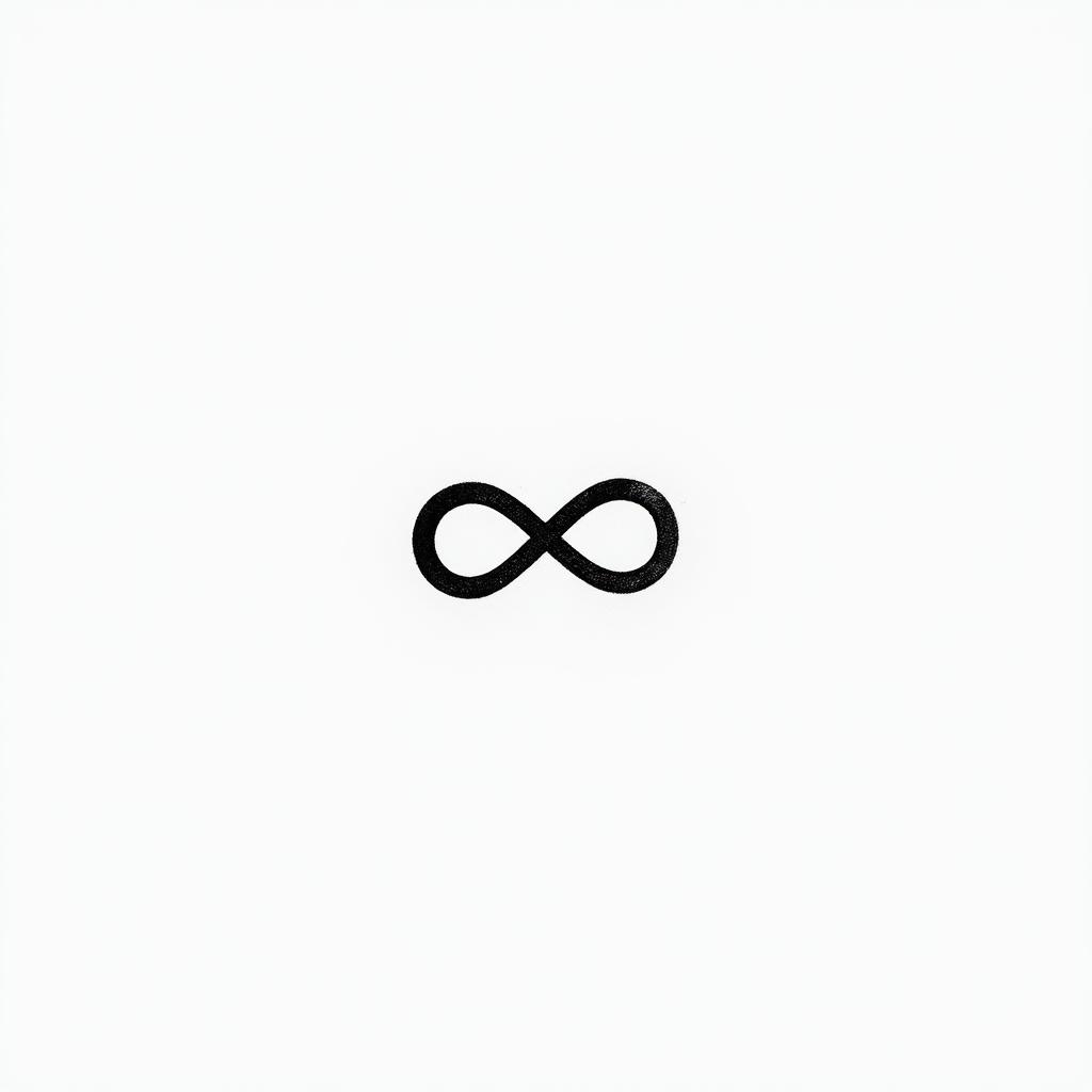
Infinity symbol. Made with the name Robertminimalist text-based tattoo, Monospace font ultra-realistic, perfectly placed, high-quality font design, photo-realistic shading, 8k, high quality, finely detailed typograph
Infinity symbol. Made with the name Robertminimalist text-based tattoo, Monospace font ultra-realistic, perfectly placed, high-quality font design, photo-realistic shading, 8k, high quality, finely detailed typograph
Monospace Text
View It is good.minimalist text-based tattoo, Monospace font ultra-realistic, perfectly placed, high-quality font design, photo-realistic shading, 8k, high quality, finely detailed typograph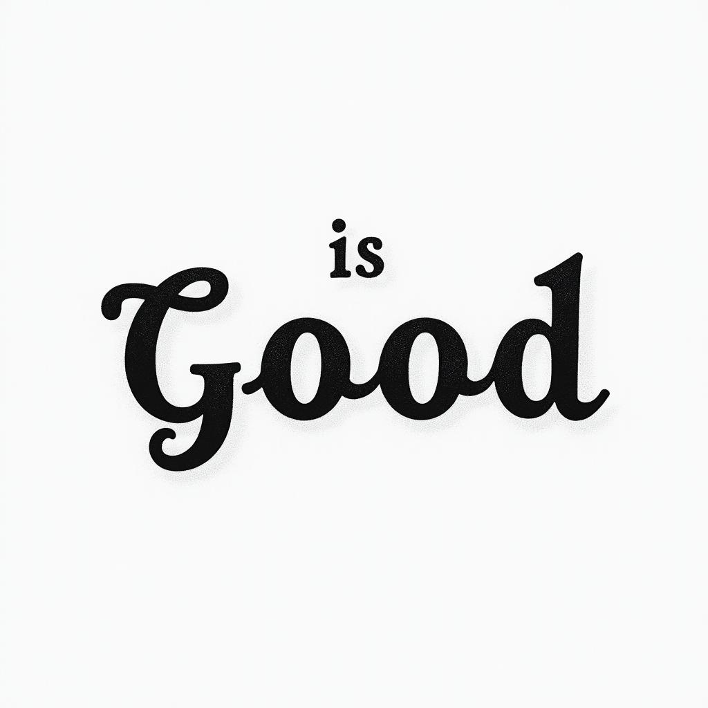
It is good.minimalist text-based tattoo, Monospace font ultra-realistic, perfectly placed, high-quality font design, photo-realistic shading, 8k, high quality, finely detailed typograph
It is good.minimalist text-based tattoo, Monospace font ultra-realistic, perfectly placed, high-quality font design, photo-realistic shading, 8k, high quality, finely detailed typograph
Monospace Text
View Dragon Ball Z, One Piece, Naruto, and Solo Leveling all together.minimalist text-based tattoo, Monospace font ultra-realistic, perfectly placed, high-quality font design, photo-realistic shading, 8k, high quality, finely detailed typograph
Dragon Ball Z, One Piece, Naruto, and Solo Leveling all together.minimalist text-based tattoo, Monospace font ultra-realistic, perfectly placed, high-quality font design, photo-realistic shading, 8k, high quality, finely detailed typograph
Dragon Ball Z, One Piece, Naruto, and Solo Leveling all together.minimalist text-based tattoo, Monospace font ultra-realistic, perfectly placed, high-quality font design, photo-realistic shading, 8k, high quality, finely detailed typograph
Monospace Text
View My favorite personminimalist text-based tattoo, Monospace font ultra-realistic, perfectly placed, high-quality font design, photo-realistic shading, 8k, high quality, finely detailed typograph
My favorite personminimalist text-based tattoo, Monospace font ultra-realistic, perfectly placed, high-quality font design, photo-realistic shading, 8k, high quality, finely detailed typograph
My favorite personminimalist text-based tattoo, Monospace font ultra-realistic, perfectly placed, high-quality font design, photo-realistic shading, 8k, high quality, finely detailed typograph
Monospace Text
View Momminimalist text-based tattoo, Monospace font ultra-realistic, perfectly placed, high-quality font design, photo-realistic shading, 8k, high quality, finely detailed typograph
Momminimalist text-based tattoo, Monospace font ultra-realistic, perfectly placed, high-quality font design, photo-realistic shading, 8k, high quality, finely detailed typograph
Momminimalist text-based tattoo, Monospace font ultra-realistic, perfectly placed, high-quality font design, photo-realistic shading, 8k, high quality, finely detailed typograph
Monospace Text
View Nicolasminimalist text-based tattoo, Monospace font ultra-realistic, perfectly placed, high-quality font design, photo-realistic shading, 8k, high quality, finely detailed typograph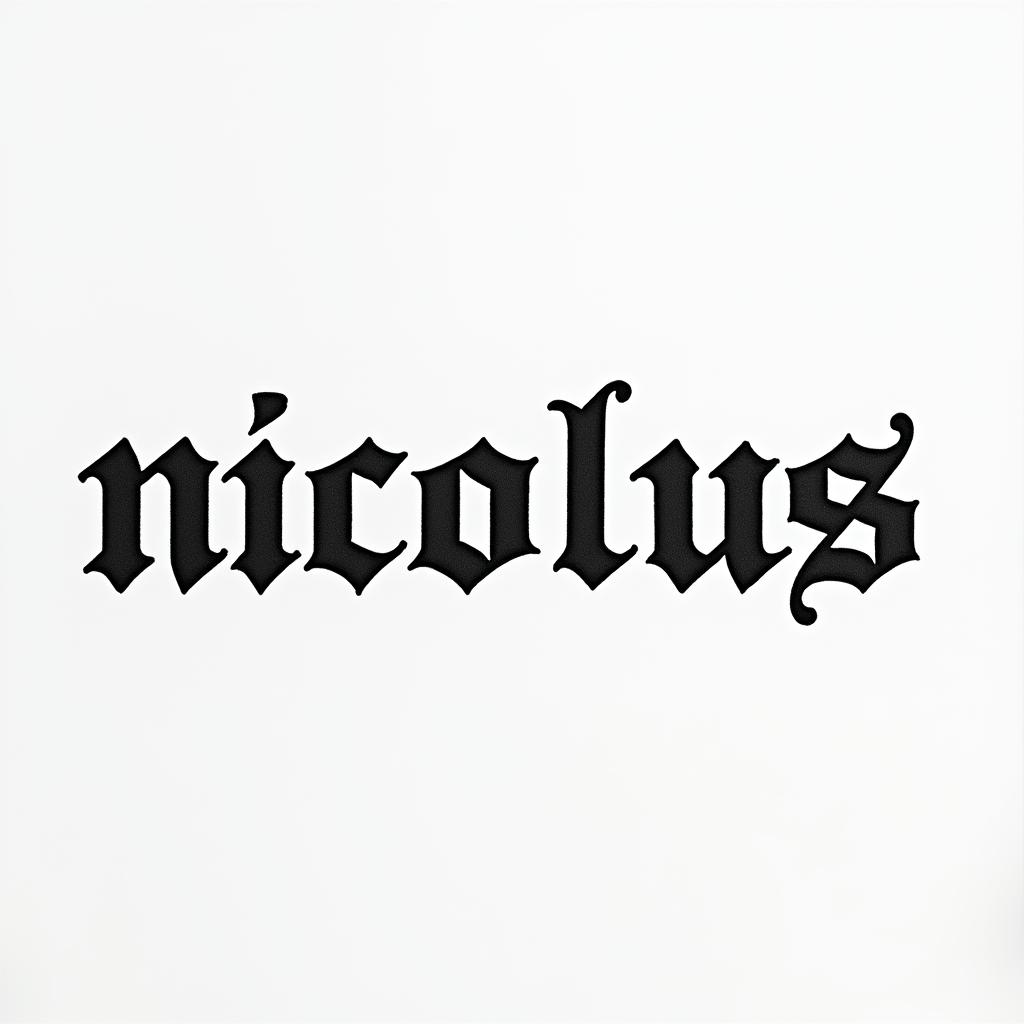
Nicolasminimalist text-based tattoo, Monospace font ultra-realistic, perfectly placed, high-quality font design, photo-realistic shading, 8k, high quality, finely detailed typograph
Nicolasminimalist text-based tattoo, Monospace font ultra-realistic, perfectly placed, high-quality font design, photo-realistic shading, 8k, high quality, finely detailed typograph
Monospace Text
View Collins construction companyminimalist text-based tattoo, Monospace font ultra-realistic, perfectly placed, high-quality font design, photo-realistic shading, 8k, high quality, finely detailed typograph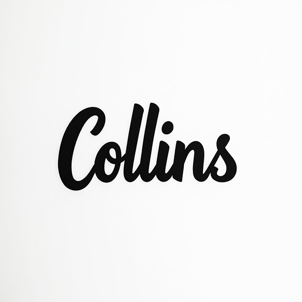
Collins construction companyminimalist text-based tattoo, Monospace font ultra-realistic, perfectly placed, high-quality font design, photo-realistic shading, 8k, high quality, finely detailed typograph
Collins construction companyminimalist text-based tattoo, Monospace font ultra-realistic, perfectly placed, high-quality font design, photo-realistic shading, 8k, high quality, finely detailed typograph
Monospace Text
View Tattoo on the forearm with the name Livio and the date of birth 05/03/2024 as well as a lotus flower and a few lotuses quite dense and contrasted.minimalist text-based tattoo, Monospace font ultra-realistic, perfectly placed, high-quality font design, photo-realistic shading, 8k, high quality, finely detailed typograph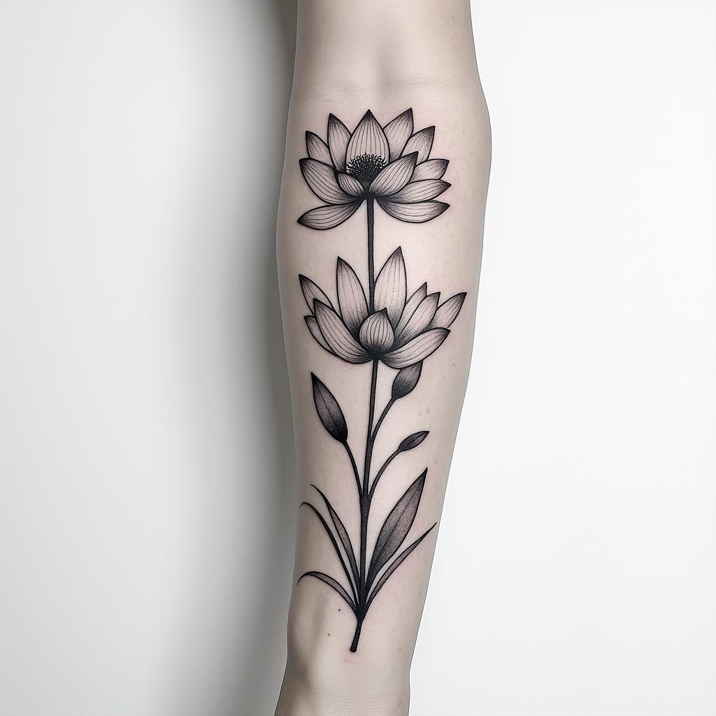
Tattoo on the forearm with the name Livio and the date of birth 05/03/2024 as well as a lotus flower and a few lotuses quite dense and contrasted.minimalist text-based tattoo, Monospace font ultra-realistic, perfectly placed, high-quality font design, photo-realistic shading, 8k, high quality, finely detailed typograph
Tattoo on the forearm with the name Livio and the date of birth 05/03/2024 as well as a lotus flower and a few lotuses quite dense and contrasted.minimalist text-based tattoo, Monospace font ultra-realistic, perfectly placed, high-quality font design, photo-realistic shading, 8k, high quality, finely detailed typograph
Monospace Text
View Raffaëlminimalist text-based tattoo, Monospace font ultra-realistic, perfectly placed, high-quality font design, photo-realistic shading, 8k, high quality, finely detailed typograph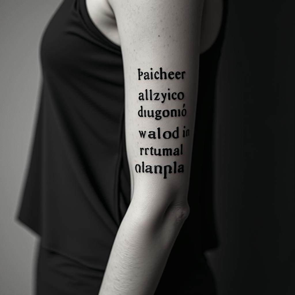
Raffaëlminimalist text-based tattoo, Monospace font ultra-realistic, perfectly placed, high-quality font design, photo-realistic shading, 8k, high quality, finely detailed typograph
Raffaëlminimalist text-based tattoo, Monospace font ultra-realistic, perfectly placed, high-quality font design, photo-realistic shading, 8k, high quality, finely detailed typograph
Monospace Text
View Jéssica my wife and children Amanda and Antonyminimalist text-based tattoo, Monospace font ultra-realistic, perfectly placed, high-quality font design, photo-realistic shading, 8k, high quality, finely detailed typograph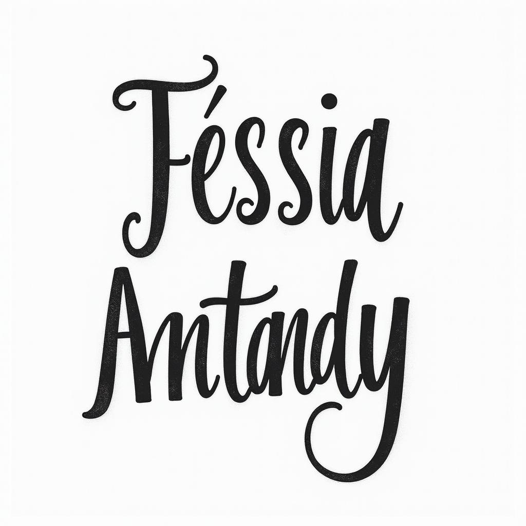
Jéssica my wife and children Amanda and Antonyminimalist text-based tattoo, Monospace font ultra-realistic, perfectly placed, high-quality font design, photo-realistic shading, 8k, high quality, finely detailed typograph
Jéssica my wife and children Amanda and Antonyminimalist text-based tattoo, Monospace font ultra-realistic, perfectly placed, high-quality font design, photo-realistic shading, 8k, high quality, finely detailed typograph
Monospace Text
View Errolminimalist text-based tattoo, Monospace font ultra-realistic, perfectly placed, high-quality font design, photo-realistic shading, 8k, high quality, finely detailed typograph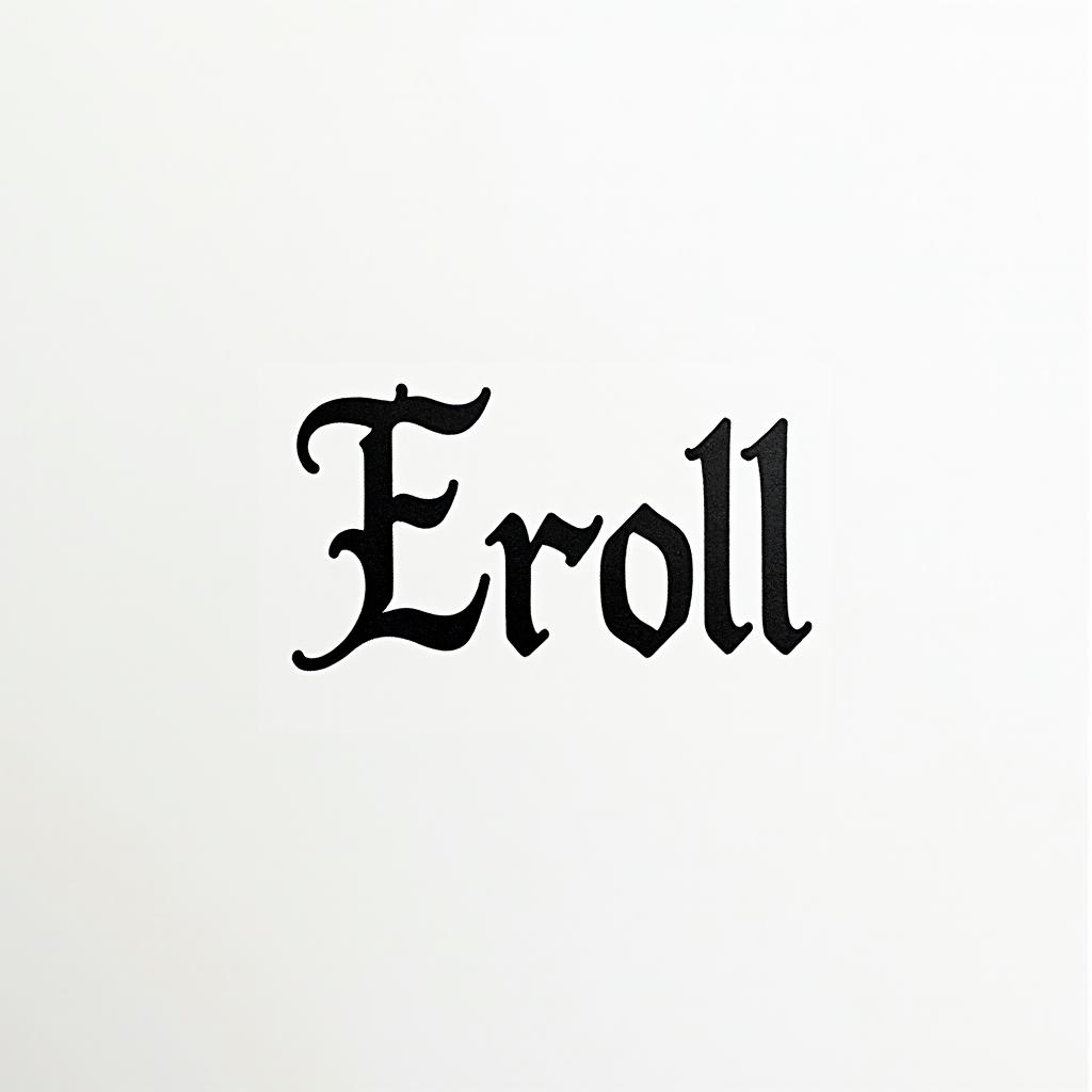
Errolminimalist text-based tattoo, Monospace font ultra-realistic, perfectly placed, high-quality font design, photo-realistic shading, 8k, high quality, finely detailed typograph
Errolminimalist text-based tattoo, Monospace font ultra-realistic, perfectly placed, high-quality font design, photo-realistic shading, 8k, high quality, finely detailed typograph
Monospace Text
View half sleeve tattoo of the word “rackbodin” with clloudsminimalist text-based tattoo, Monospace font ultra-realistic, perfectly placed, high-quality font design, photo-realistic shading, 8k, high quality, finely detailed typograph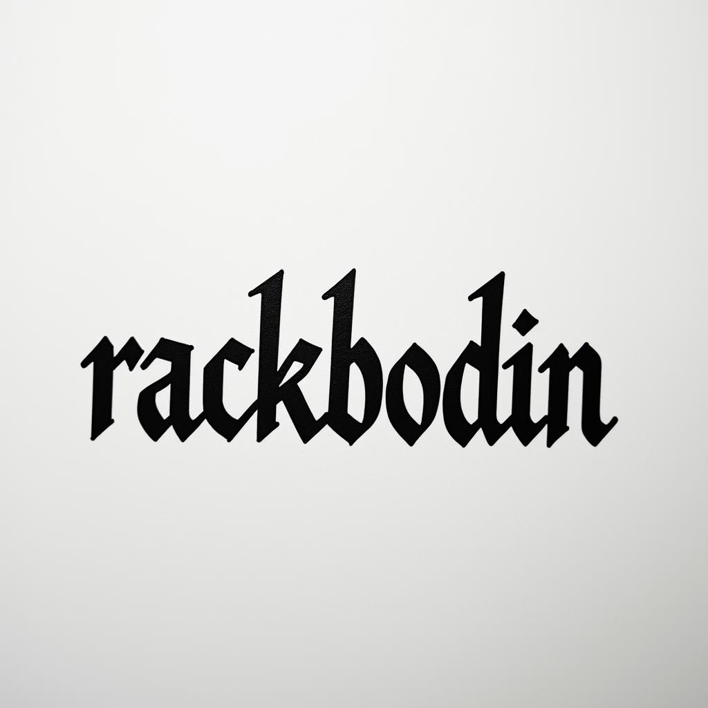
half sleeve tattoo of the word “rackbodin” with clloudsminimalist text-based tattoo, Monospace font ultra-realistic, perfectly placed, high-quality font design, photo-realistic shading, 8k, high quality, finely detailed typograph
half sleeve tattoo of the word “rackbodin” with clloudsminimalist text-based tattoo, Monospace font ultra-realistic, perfectly placed, high-quality font design, photo-realistic shading, 8k, high quality, finely detailed typograph
Monospace Text
View Wahab and Honey names intertwinedminimalist text-based tattoo, Monospace font ultra-realistic, perfectly placed, high-quality font design, photo-realistic shading, 8k, high quality, finely detailed typograph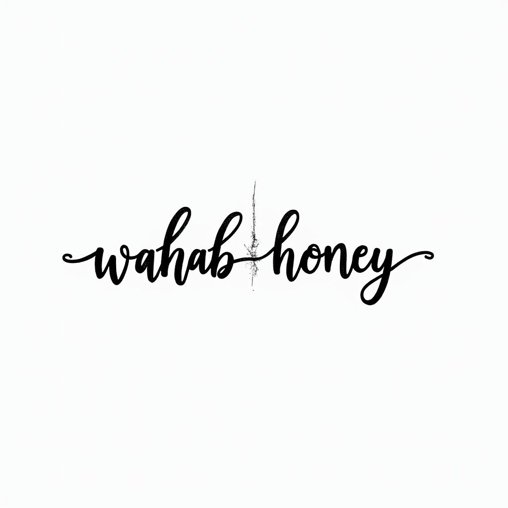
Wahab and Honey names intertwinedminimalist text-based tattoo, Monospace font ultra-realistic, perfectly placed, high-quality font design, photo-realistic shading, 8k, high quality, finely detailed typograph
Wahab and Honey names intertwinedminimalist text-based tattoo, Monospace font ultra-realistic, perfectly placed, high-quality font design, photo-realistic shading, 8k, high quality, finely detailed typograph
Monospace Text