View Luke 6:37 -
Judge not, and ye shall not be judged: condemn not, and ye shall not be condemned: forgive, and ye shall be forgiven:text-based tattoo, gothic font ultra-realistic, perfectly placed, high-quality font design, photo-realistic shading, 8k, high quality, finely detailed typography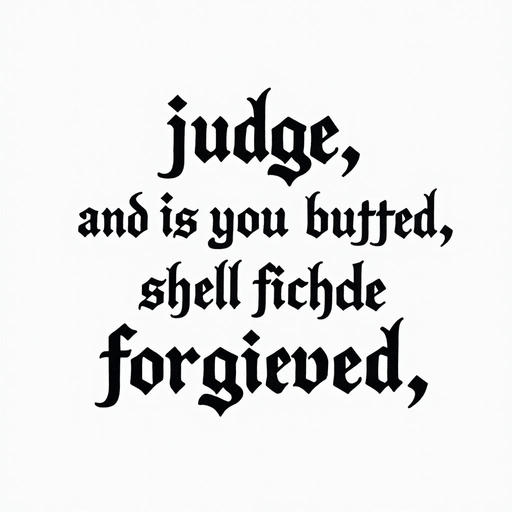
Luke 6:37 - Judge not, and ye shall not be judged: condemn not, and ye shall not be condemned: forgive, and ye shall be forgiven:text-based tattoo, gothic font ultra-realistic, perfectly placed, high-quality font design, photo-realistic shading, 8k, high quality, finely detailed typography
Luke 6:37 - Judge not, and ye shall not be judged: condemn not, and ye shall not be condemned: forgive, and ye shall be forgiven:text-based tattoo, gothic font ultra-realistic, perfectly placed, high-quality font design, photo-realistic shading, 8k, high quality, finely detailed typography
Gothic Text
View Everything for not studying in Spanishtext-based tattoo, gothic font ultra-realistic, perfectly placed, high-quality font design, photo-realistic shading, 8k, high quality, finely detailed typography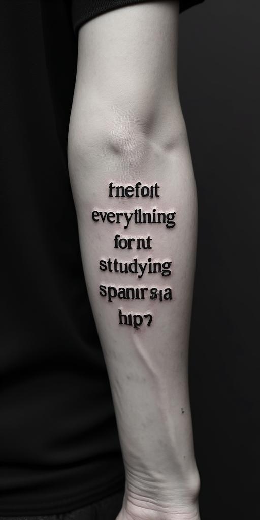
Everything for not studying in Spanishtext-based tattoo, gothic font ultra-realistic, perfectly placed, high-quality font design, photo-realistic shading, 8k, high quality, finely detailed typography
Everything for not studying in Spanishtext-based tattoo, gothic font ultra-realistic, perfectly placed, high-quality font design, photo-realistic shading, 8k, high quality, finely detailed typography
Gothic Text
View Noah, Libra, Gastoniatext-based tattoo, gothic font ultra-realistic, perfectly placed, high-quality font design, photo-realistic shading, 8k, high quality, finely detailed typography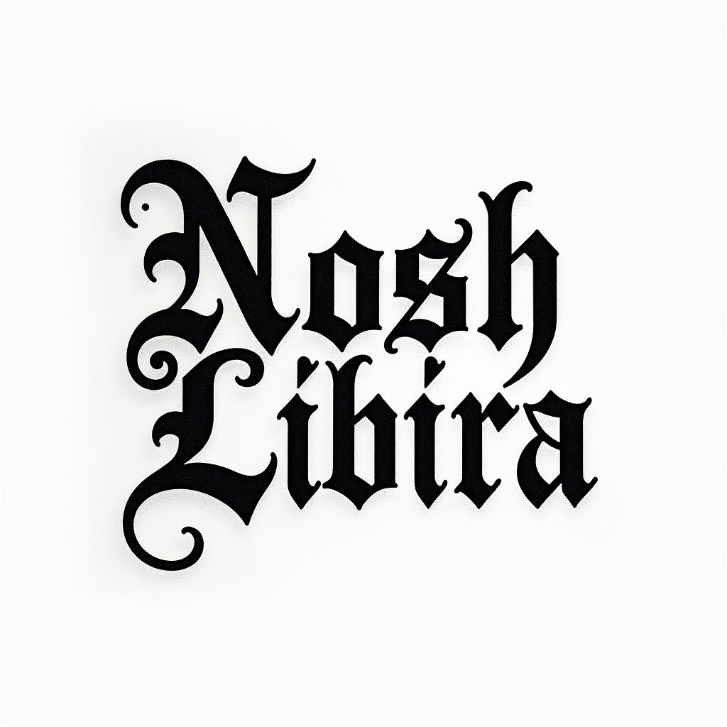
Noah, Libra, Gastoniatext-based tattoo, gothic font ultra-realistic, perfectly placed, high-quality font design, photo-realistic shading, 8k, high quality, finely detailed typography
Noah, Libra, Gastoniatext-based tattoo, gothic font ultra-realistic, perfectly placed, high-quality font design, photo-realistic shading, 8k, high quality, finely detailed typography
Gothic Text
View Knowledge wisdom understandingtext-based tattoo, gothic font ultra-realistic, perfectly placed, high-quality font design, photo-realistic shading, 8k, high quality, finely detailed typography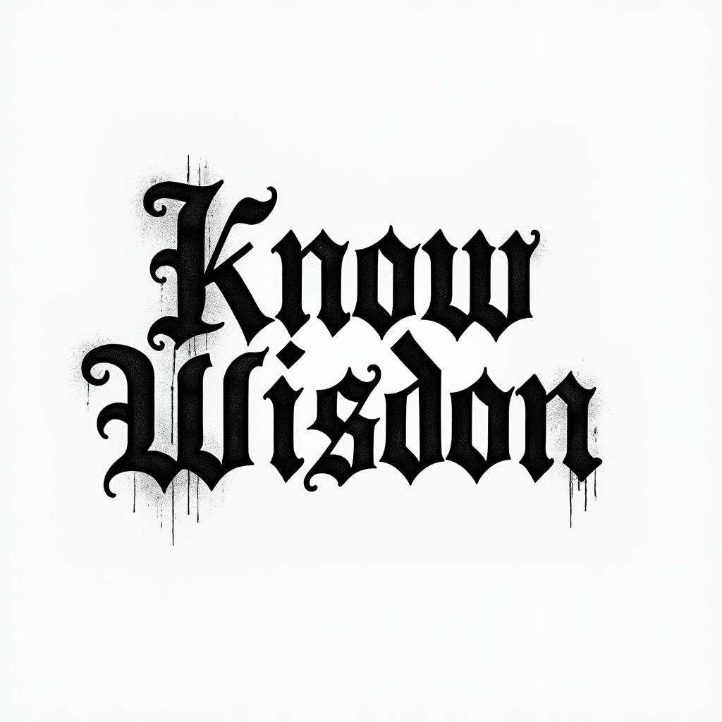
Knowledge wisdom understandingtext-based tattoo, gothic font ultra-realistic, perfectly placed, high-quality font design, photo-realistic shading, 8k, high quality, finely detailed typography
Knowledge wisdom understandingtext-based tattoo, gothic font ultra-realistic, perfectly placed, high-quality font design, photo-realistic shading, 8k, high quality, finely detailed typography
Gothic Text
View Flame outline backgroundtext-based tattoo, gothic font ultra-realistic, perfectly placed, high-quality font design, photo-realistic shading, 8k, high quality, finely detailed typography
Flame outline backgroundtext-based tattoo, gothic font ultra-realistic, perfectly placed, high-quality font design, photo-realistic shading, 8k, high quality, finely detailed typography
Flame outline backgroundtext-based tattoo, gothic font ultra-realistic, perfectly placed, high-quality font design, photo-realistic shading, 8k, high quality, finely detailed typography
Gothic Text
View Luke 6:37 -
Judge not, and you shall not be judged: condemn not, and you shall not be condemned: forgive, and you shall be forgiven:text-based tattoo, gothic font ultra-realistic, perfectly placed, high-quality font design, photo-realistic shading, 8k, high quality, finely detailed typography
Luke 6:37 - Judge not, and you shall not be judged: condemn not, and you shall not be condemned: forgive, and you shall be forgiven:text-based tattoo, gothic font ultra-realistic, perfectly placed, high-quality font design, photo-realistic shading, 8k, high quality, finely detailed typography
Luke 6:37 - Judge not, and you shall not be judged: condemn not, and you shall not be condemned: forgive, and you shall be forgiven:text-based tattoo, gothic font ultra-realistic, perfectly placed, high-quality font design, photo-realistic shading, 8k, high quality, finely detailed typography
Gothic Text
View A phrase "rdc closed with the right one🤟🏻🍁text-based tattoo, gothic font ultra-realistic, perfectly placed, high-quality font design, photo-realistic shading, 8k, high quality, finely detailed typography
A phrase "rdc closed with the right one🤟🏻🍁text-based tattoo, gothic font ultra-realistic, perfectly placed, high-quality font design, photo-realistic shading, 8k, high quality, finely detailed typography
A phrase "rdc closed with the right one🤟🏻🍁text-based tattoo, gothic font ultra-realistic, perfectly placed, high-quality font design, photo-realistic shading, 8k, high quality, finely detailed typography
Gothic Text
View Bo mega constructiontext-based tattoo, gothic font ultra-realistic, perfectly placed, high-quality font design, photo-realistic shading, 8k, high quality, finely detailed typography
Bo mega constructiontext-based tattoo, gothic font ultra-realistic, perfectly placed, high-quality font design, photo-realistic shading, 8k, high quality, finely detailed typography
Bo mega constructiontext-based tattoo, gothic font ultra-realistic, perfectly placed, high-quality font design, photo-realistic shading, 8k, high quality, finely detailed typography
Gothic Text
View All for not studying.text-based tattoo, gothic font ultra-realistic, perfectly placed, high-quality font design, photo-realistic shading, 8k, high quality, finely detailed typography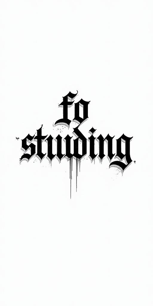
All for not studying.text-based tattoo, gothic font ultra-realistic, perfectly placed, high-quality font design, photo-realistic shading, 8k, high quality, finely detailed typography
All for not studying.text-based tattoo, gothic font ultra-realistic, perfectly placed, high-quality font design, photo-realistic shading, 8k, high quality, finely detailed typography
Gothic Text
View All for not studyingtext-based tattoo, gothic font ultra-realistic, perfectly placed, high-quality font design, photo-realistic shading, 8k, high quality, finely detailed typography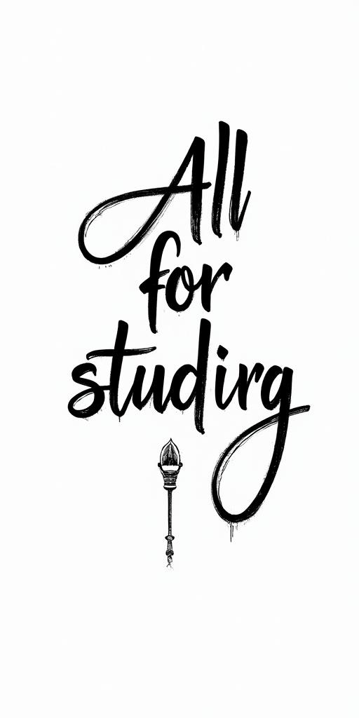
All for not studyingtext-based tattoo, gothic font ultra-realistic, perfectly placed, high-quality font design, photo-realistic shading, 8k, high quality, finely detailed typography
All for not studyingtext-based tattoo, gothic font ultra-realistic, perfectly placed, high-quality font design, photo-realistic shading, 8k, high quality, finely detailed typography
Gothic Text
View Louisette & Pierrottext-based tattoo, gothic font ultra-realistic, perfectly placed, high-quality font design, photo-realistic shading, 8k, high quality, finely detailed typography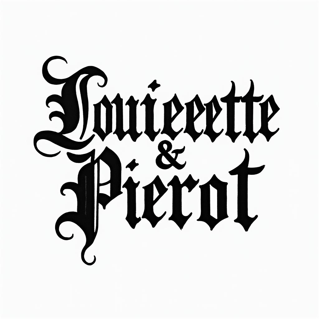
Louisette & Pierrottext-based tattoo, gothic font ultra-realistic, perfectly placed, high-quality font design, photo-realistic shading, 8k, high quality, finely detailed typography
Louisette & Pierrottext-based tattoo, gothic font ultra-realistic, perfectly placed, high-quality font design, photo-realistic shading, 8k, high quality, finely detailed typography
Gothic Text
View Sagittariustext-based tattoo, gothic font ultra-realistic, perfectly placed, high-quality font design, photo-realistic shading, 8k, high quality, finely detailed typography
Sagittariustext-based tattoo, gothic font ultra-realistic, perfectly placed, high-quality font design, photo-realistic shading, 8k, high quality, finely detailed typography
Sagittariustext-based tattoo, gothic font ultra-realistic, perfectly placed, high-quality font design, photo-realistic shading, 8k, high quality, finely detailed typography
Gothic Text
View Two names Wahab & Honey joining togethertext-based tattoo, gothic font ultra-realistic, perfectly placed, high-quality font design, photo-realistic shading, 8k, high quality, finely detailed typography
Two names Wahab & Honey joining togethertext-based tattoo, gothic font ultra-realistic, perfectly placed, high-quality font design, photo-realistic shading, 8k, high quality, finely detailed typography
Two names Wahab & Honey joining togethertext-based tattoo, gothic font ultra-realistic, perfectly placed, high-quality font design, photo-realistic shading, 8k, high quality, finely detailed typography
Gothic Text
View 2007/03/24. Josmar Jesús Mendoza Lópeztext-based tattoo, gothic font ultra-realistic, perfectly placed, high-quality font design, photo-realistic shading, 8k, high quality, finely detailed typography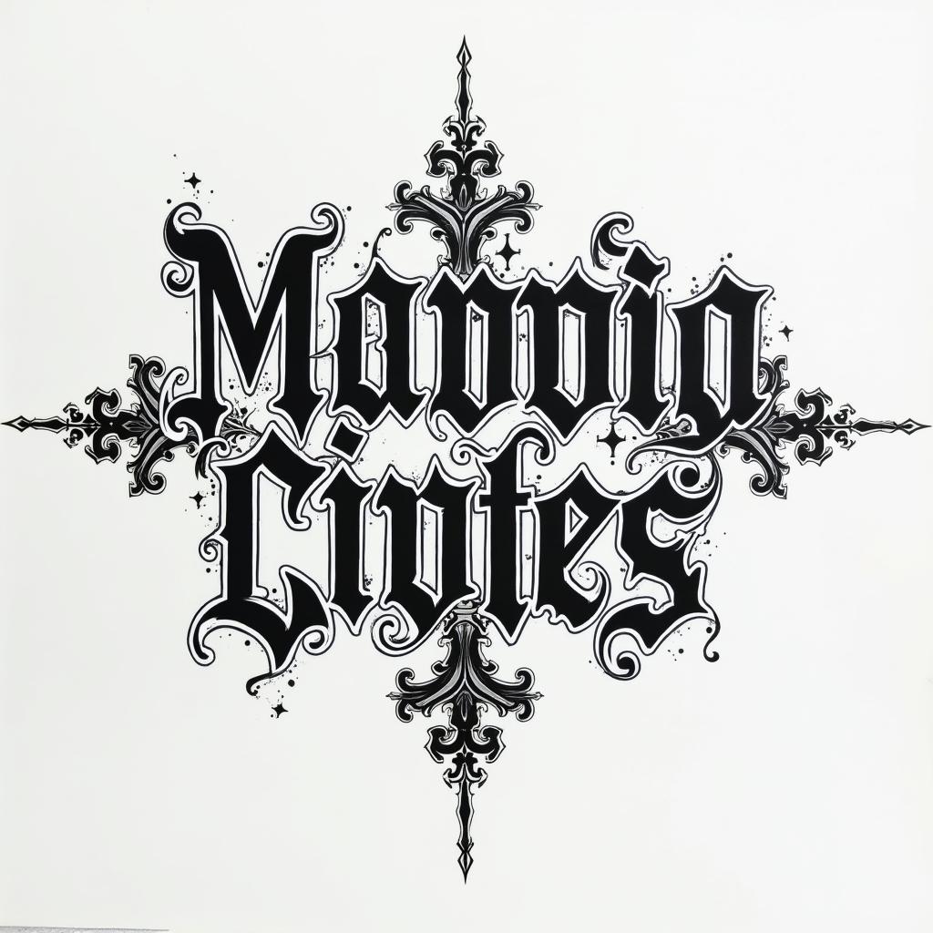
2007/03/24. Josmar Jesús Mendoza Lópeztext-based tattoo, gothic font ultra-realistic, perfectly placed, high-quality font design, photo-realistic shading, 8k, high quality, finely detailed typography
2007/03/24. Josmar Jesús Mendoza Lópeztext-based tattoo, gothic font ultra-realistic, perfectly placed, high-quality font design, photo-realistic shading, 8k, high quality, finely detailed typography
Gothic Text
View music notes and text saying forever friends with drum sticks and colorful butterflies flying aroundtext-based tattoo, gothic font ultra-realistic, perfectly placed, high-quality font design, photo-realistic shading, 8k, high quality, finely detailed typography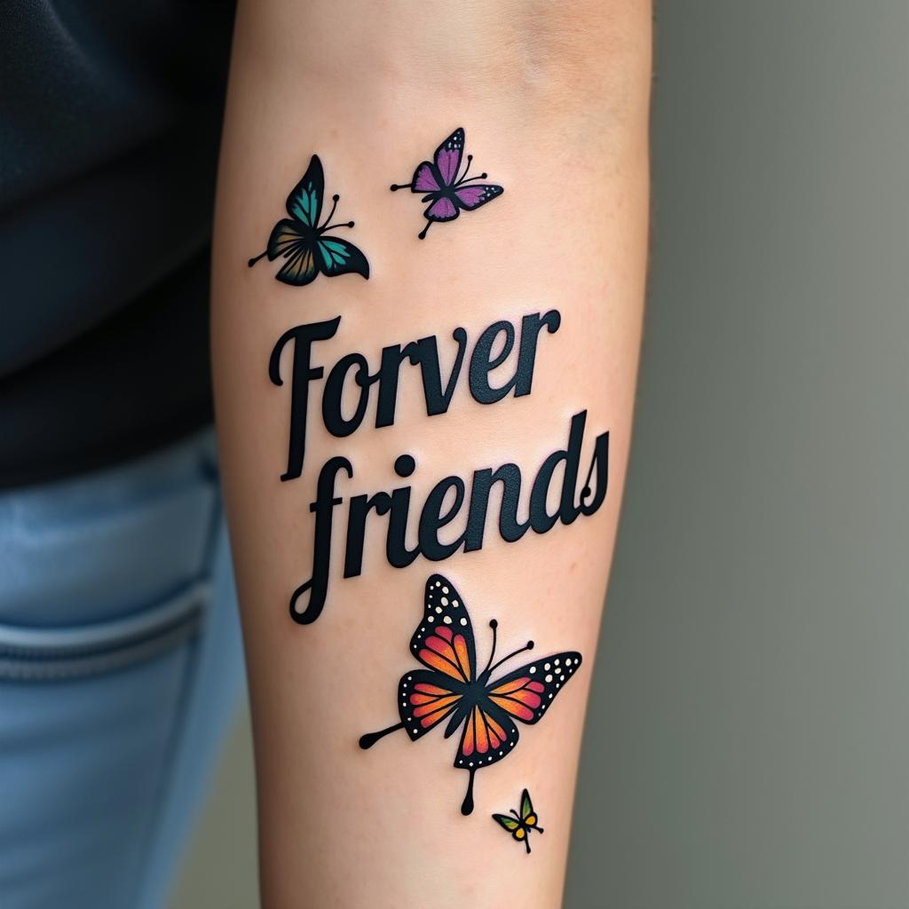
music notes and text saying forever friends with drum sticks and colorful butterflies flying aroundtext-based tattoo, gothic font ultra-realistic, perfectly placed, high-quality font design, photo-realistic shading, 8k, high quality, finely detailed typography
music notes and text saying forever friends with drum sticks and colorful butterflies flying aroundtext-based tattoo, gothic font ultra-realistic, perfectly placed, high-quality font design, photo-realistic shading, 8k, high quality, finely detailed typography
Gothic Text
View Jordantext-based tattoo, gothic font ultra-realistic, perfectly placed, high-quality font design, photo-realistic shading, 8k, high quality, finely detailed typography
Jordantext-based tattoo, gothic font ultra-realistic, perfectly placed, high-quality font design, photo-realistic shading, 8k, high quality, finely detailed typography
Jordantext-based tattoo, gothic font ultra-realistic, perfectly placed, high-quality font design, photo-realistic shading, 8k, high quality, finely detailed typography
Gothic Text
View DJ with the tables, I love music. I’m a Virgo from Denvertext-based tattoo, gothic font ultra-realistic, perfectly placed, high-quality font design, photo-realistic shading, 8k, high quality, finely detailed typography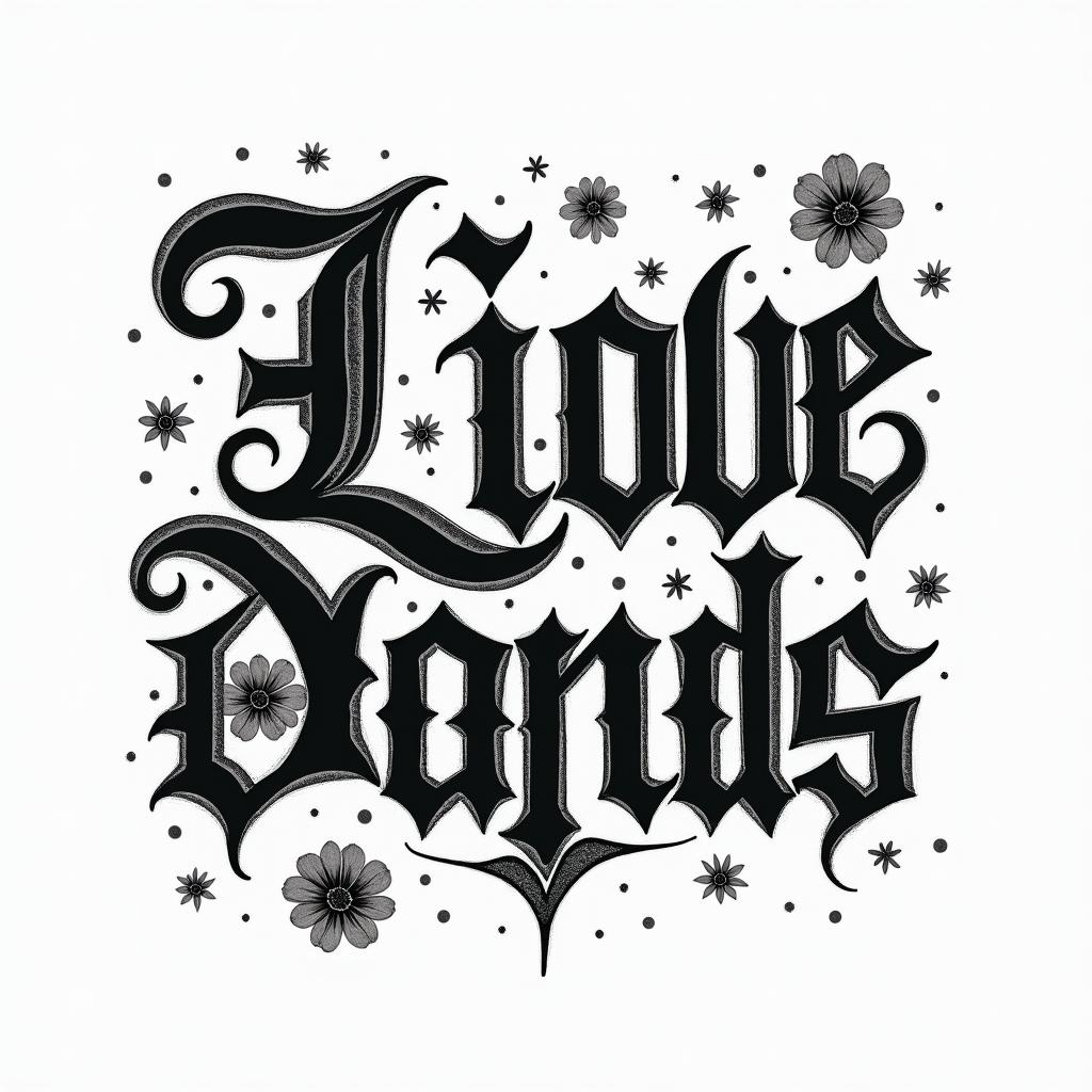
DJ with the tables, I love music. I’m a Virgo from Denvertext-based tattoo, gothic font ultra-realistic, perfectly placed, high-quality font design, photo-realistic shading, 8k, high quality, finely detailed typography
DJ with the tables, I love music. I’m a Virgo from Denvertext-based tattoo, gothic font ultra-realistic, perfectly placed, high-quality font design, photo-realistic shading, 8k, high quality, finely detailed typography
Gothic Text
View Rubytext-based tattoo, gothic font ultra-realistic, perfectly placed, high-quality font design, photo-realistic shading, 8k, high quality, finely detailed typography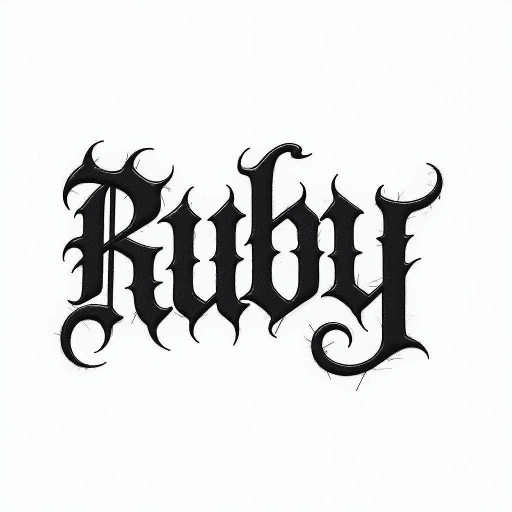
Rubytext-based tattoo, gothic font ultra-realistic, perfectly placed, high-quality font design, photo-realistic shading, 8k, high quality, finely detailed typography
Rubytext-based tattoo, gothic font ultra-realistic, perfectly placed, high-quality font design, photo-realistic shading, 8k, high quality, finely detailed typography
Gothic Text
View Catalina Gemini Francisco Libratext-based tattoo, gothic font ultra-realistic, perfectly placed, high-quality font design, photo-realistic shading, 8k, high quality, finely detailed typography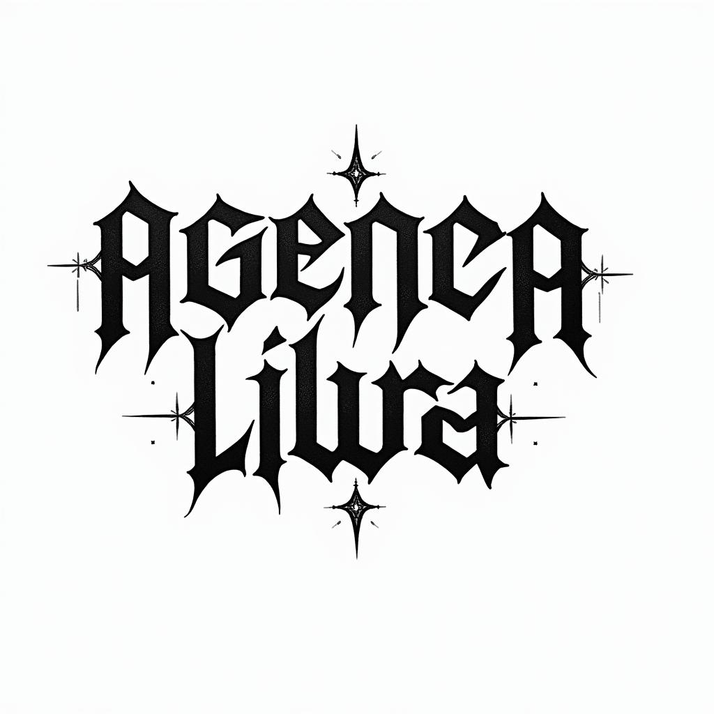
Catalina Gemini Francisco Libratext-based tattoo, gothic font ultra-realistic, perfectly placed, high-quality font design, photo-realistic shading, 8k, high quality, finely detailed typography
Catalina Gemini Francisco Libratext-based tattoo, gothic font ultra-realistic, perfectly placed, high-quality font design, photo-realistic shading, 8k, high quality, finely detailed typography
Gothic Text
View Janine September Berlin 1978text-based tattoo, gothic font ultra-realistic, perfectly placed, high-quality font design, photo-realistic shading, 8k, high quality, finely detailed typography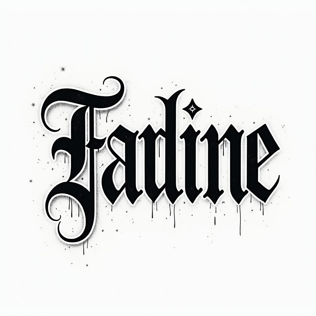
Janine September Berlin 1978text-based tattoo, gothic font ultra-realistic, perfectly placed, high-quality font design, photo-realistic shading, 8k, high quality, finely detailed typography
Janine September Berlin 1978text-based tattoo, gothic font ultra-realistic, perfectly placed, high-quality font design, photo-realistic shading, 8k, high quality, finely detailed typography
Gothic Text
View Gerardo25text-based tattoo, gothic font ultra-realistic, perfectly placed, high-quality font design, photo-realistic shading, 8k, high quality, finely detailed typography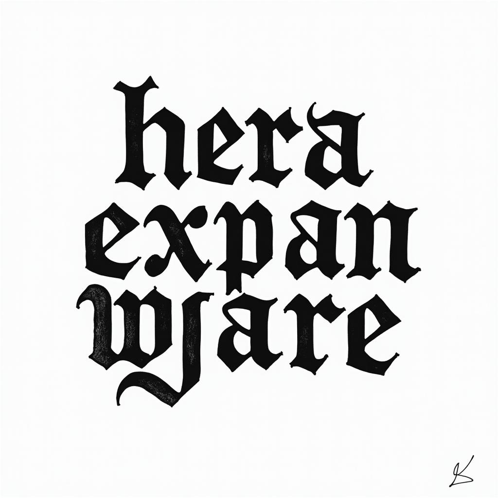
Gerardo25text-based tattoo, gothic font ultra-realistic, perfectly placed, high-quality font design, photo-realistic shading, 8k, high quality, finely detailed typography
Gerardo25text-based tattoo, gothic font ultra-realistic, perfectly placed, high-quality font design, photo-realistic shading, 8k, high quality, finely detailed typography
Gothic Text
View Skull with roses and clock elementstext-based tattoo, gothic font ultra-realistic, perfectly placed, high-quality font design, photo-realistic shading, 8k, high quality, finely detailed typography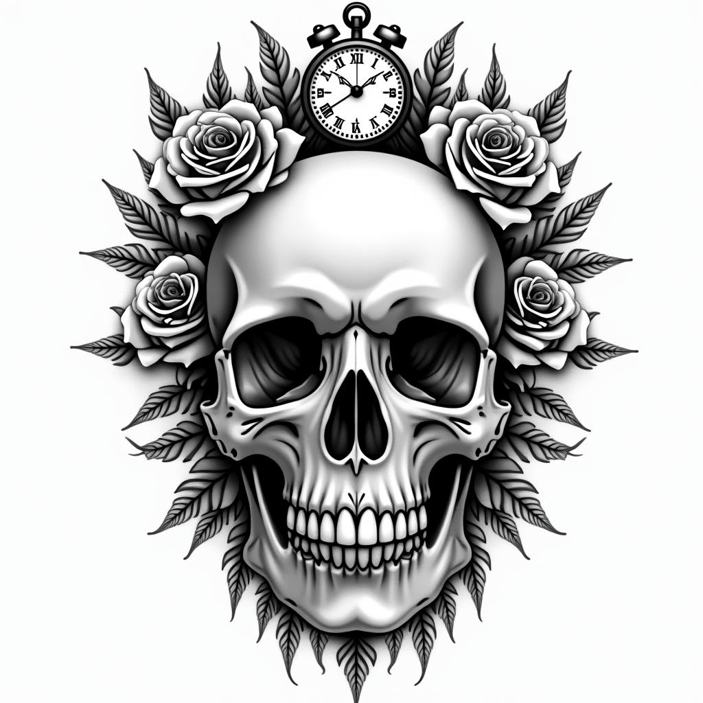
Skull with roses and clock elementstext-based tattoo, gothic font ultra-realistic, perfectly placed, high-quality font design, photo-realistic shading, 8k, high quality, finely detailed typography
Skull with roses and clock elementstext-based tattoo, gothic font ultra-realistic, perfectly placed, high-quality font design, photo-realistic shading, 8k, high quality, finely detailed typography
Gothic Text
View VALDUZtext-based tattoo, gothic font ultra-realistic, perfectly placed, high-quality font design, photo-realistic shading, 8k, high quality, finely detailed typography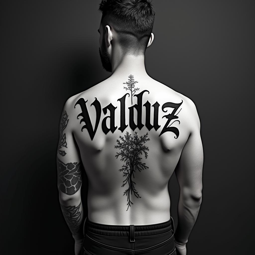
VALDUZtext-based tattoo, gothic font ultra-realistic, perfectly placed, high-quality font design, photo-realistic shading, 8k, high quality, finely detailed typography
VALDUZtext-based tattoo, gothic font ultra-realistic, perfectly placed, high-quality font design, photo-realistic shading, 8k, high quality, finely detailed typography
Gothic Text
View native americantext-based tattoo, gothic font ultra-realistic, perfectly placed, high-quality font design, photo-realistic shading, 8k, high quality, finely detailed typography
native americantext-based tattoo, gothic font ultra-realistic, perfectly placed, high-quality font design, photo-realistic shading, 8k, high quality, finely detailed typography
native americantext-based tattoo, gothic font ultra-realistic, perfectly placed, high-quality font design, photo-realistic shading, 8k, high quality, finely detailed typography
Gothic Text